Some of the toughest style writers in the game flexed their graffiti alphabet and we were mind blown. It’s one thing knowing how to rock the four or five letters of your name but can you rock a whole alphabet with the same consistency? That’s the challenge and these guys rocked it with style and precision. Today we will go through them one by one to break them down and give you our analysis. Let’s get it!
Shop: Get Free Stickers and Free Graffiti Supplies
Graffiti Alphabets

ATOMS
Atoms came through with a bubble letter throwie style, in full color. Besides the super clean execution, Atoms decorated it with ladybugs, bees and monarchs for good luck as a dedication to Diva’s fight with cancer. This is truly a beautiful, sentimental alphabet that was very well put together from A to Z. Much luck, love and light to Diva.

CEAF
You can’t go wrong with a classic East coast straight-letter steez which Ceafpulled it off nice and neat. Simple, clean and straight to the point, this alphabet is well-consistent with a steady flow. I like how he highlighted the letters of his name and crews. Nice touch!

IZER
All I can say is WOW. Izer, taking wildstyle to a whole new level of detail and intricacy. The amount of detail from the borders of the frame to the triple fonts on top of the wildstyle is mind-blowing. The type of alphabet you can stare at for hours. A true masterpiece!

SYHIS
Other than the fact that it took 288 priority mail stickers to pull this off, this one by Syhis is simply crazy. Each letter can stand alone. Each one has its own universe with a personal color scheme and a plethora of details, yet when put together everything comes together and it’s undeniably all from the same artist. Bravo!

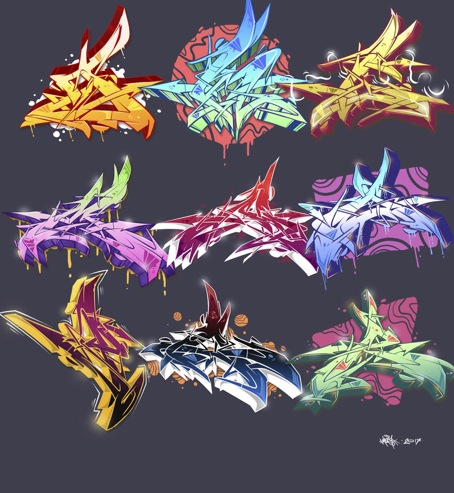

MEAS7
Traditional wildstyle, on steroids. Maybe not steroids, maybe like lots of exercise and cold-pressed organic juices. Either way, each letter looks perfectly balanced no matter how wild it gets. Never losing form, the letters look good even when stripped naked. Check out his Instagram.

JAMEY JASPER
You can tell Jamey had fun doing this one with his bubble gum pop style. Each letter represents a different bombing style which is all trapped in a common mind. Big bald letters that even your grandmother’s legally blind friend could read.

DRAIN
Some of the best things in the world are the most simple. You don’t need to go all out to produce something very flavorful and Drain really hit that note with this alphabet. Clean cuts, simple yet swaggy letters. This is what it’s all about and he nailed it.

TIMBER
Each letter in this alphabet is ready to strike. It’s very aggressive but not brute, but rather with much finesse to it. They are in battle mode, in a Kung-Fu stance anticipating the hit from any angle but also ready to attack with cunning precision if provoked. Be sure to check his Instagram account.


WEAL
Not sure which version I like best, the black and white or the digitally colored one but holy crap, the amount of style and detail is very impressive. This is extremely diverse and creative, without even losing the actual letter forms of the alphabet. More on Weal Instagram account.

Zurik
It’s the subtle little differences that separate straight-letter styles from each other. At first glance, the classic graffiti-type straight letters seem similar but when you take a minute to break it down, each person has their clever ways of flipping the script. Zurik did just that and also finished off with his own name on the letter Z. Cheers!

KILLA EF
This isn’t something that just came to be overnight. This murderous style is a result of years of blood sweat and tears, and hardbody beers. Just look at how it all comes together ever so perfectly, while being ever so wild. It’s organic, it’s dangerous, it’s real and it’s unmistakably, KILLA EF!

DERONES
If the late 90’s, early 2000’s London style is your jam, Derones delivers the goods but with an extra component. Slick, well-balanced, readable but sometimes undefined. Well executed and beautifully presented, this Derones alphabet deserves a frame and a spot on the wall.

EAZY EANS
When you look at Eazy’s alphabet, it’s like taking a time travel machine back to the mid-90s, during the golden era of street graffiti. The type of letters that got a lot of people into graffiti back in the day. Salute.
![]()
BEET 74
Not sure if this can even be considered as a graffiti style at this point but one thing I am sure of is that it’s really awesome. Tastefully executed, this is something you’d find in a fancy design book rather than a black book. However, it still somehow maintains a graff allure to it even though it’s so removed. Check out his Instagram account too!

PEZA
Peza came through with a classic solid graff style, somewhere between straight letters and wildstyle. The letter form looks tough enough to withstand nuclear fallout. Not too crazy but far from simple, this alphabet is well balanced.

PAS1
The fusion of style and elegance is present in the alphabet by Pas1. It’s a timeless letter structure that is as old as the culture but modernized with a clean and swaggy swing. An elegant choice of colors that complement each other with a strong updated traditionalist style is always a win in my books!
UPDATE!
And we have added even more alphabets here:

Keep6 
Newsior  Mr. Ios
Opteek

Abra_Lu
So there you have it folks, lots of different styles to look through and get inspired from. We are all unique and our diversity is infinite. These alphabets are a manifestation of it.
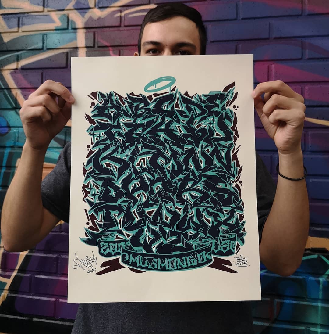
Mush
So there you have it folks, lots of different styles to look through and get inspired from. We are all unique and our diversity is infinite. These alphabets are a manifestation of it.


