
Today were gathering up some of the best graffiti drawings to show you the process graffiti artists go through before they take their work to the streets. Graffiti Drawing is an integral part to learning the art form of graffiti since it is so expensive and risky to develop every piece out on the streets. Instead graffiti artists use blackbooks to explore their techniques and learn the fundamentals. Here are some of our favorites.
Shop: Get Free Stickers and Free Graffiti Supplies

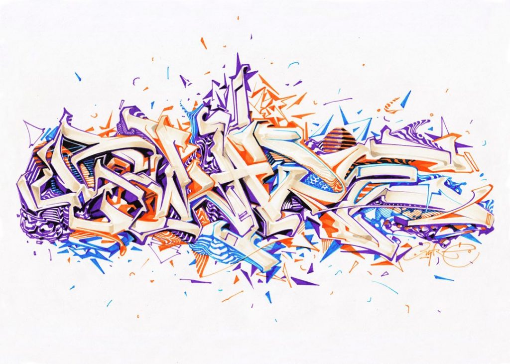
By Toeser One
Really beautiful simple colors used in this one with the simple contrast of the pink and the orange with what looks like green fill in the shadow colors.
He makes sure to break up the line for each letter to allow them to flow from one to the next.

by Rasko
Rasko going for that bubble style graffiti writing. The colors are really nice but what I appreciate about this piece is the nice 3D effect he gives to his letters.

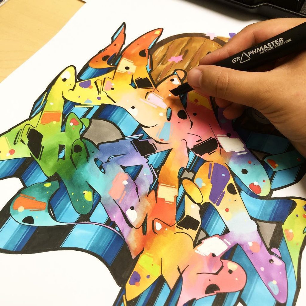
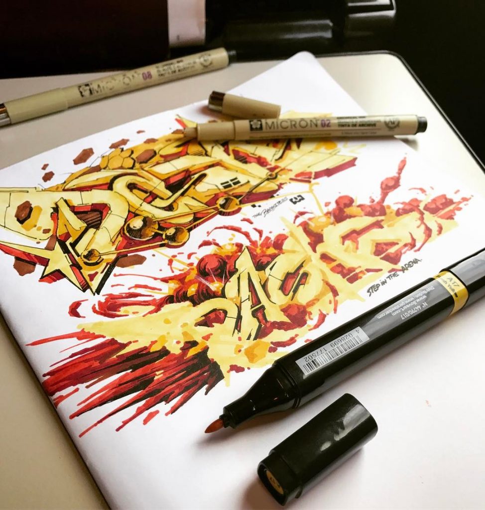
by Does
This looks like it was done with Watercolors and its just awe inspiringly beautiful. Does is an expert at being able to loose the shape of the letters into these beautiful abstract paintings that still somehow read. For more of his stuff you can check out our interview with Digital Does here.

Another example of Does losing the shape but also maintaining it. He uses a simple contrast of blue and purple contrasting with the orange red colors to great effect. He uses a couple of arrows to make our eye move to the right but drops a rectangular shape at the bottom of the S to keep our eye from not moving off the page, instead our eye flows right into the bottom of the S and back into the picture.

by Geser
Nice flow being shown here in this one, Geser takes these abstract shapes that bookend both sides of the piece and offer an oblong shape to keep our eyes in the center of the piece. Also nice addition that the Os all look like eyes.

By Sunches
Awesome Wild style piece from Sunches using a simple color contrast and taking the flow and shape design of these letters into a new realm. He bends the letters on either ends to push our eye to the center.

by Boogie
I love when Boogie incorporates these old school cartoon graffiti drawings into his pieces. His full scale pieces are out of this world, another artist we got the chance to interview here.
by Skare One
Beautiful colors, the letters themselves almost feel like negative space the way they blend into the white of the background.

by Skore 79
Skore shows the breadth of his understanding of how to push, pull and play with his letter shape.

by Ekoms
Ekoms is a master at taking letters and breaking them into abstract pieces.
by Weam One
An artist I got the chance to interview Weam One is a humble but talented dude. His colors in this piece are both intense and varied as they flow from one to another inside the shapes. He lets your eye move through the piece partly because he keeps his shadow colors in a simple range.

by Helio Bray
With over 200,000 followers on instagram this guy is a beast, check out his original work for sale through his site.
by Zurik 1
You can see the influence of graphic design on Zurik’s nice sketch here.

by Themeaseven
More black and white wildstyle by one of finest Malaysian graffiti writers in the scene.

by Raws
A cool cartoonish, collage like piece by Raws.

by Asmoe
Sometimes you don’t need color… like in this fresh graffiti drawing by Asmoe! The black and white piece and background are simply popping off the paper.

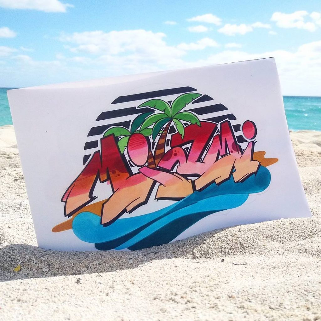
by Kimoz
Nice intergalactic portrait of cars and trains flying through space with a sick tag right in the middle by Kimoz.
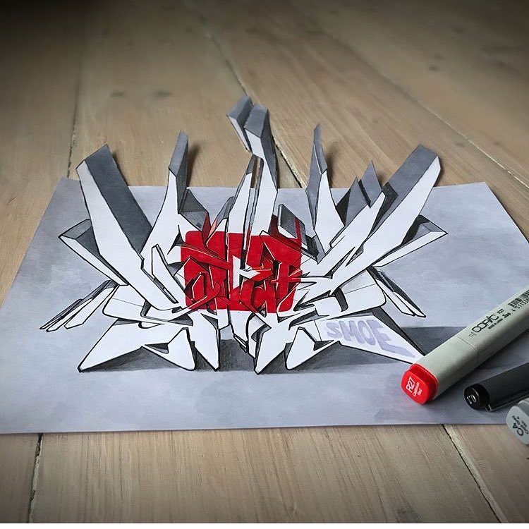
by Smoe
Nice interpretation of the Youtube logo with a sick 3d effect by Smoe.

by Musa
Musa kills it whether its in her black book or her latest big piece with her trademark psychedelic style. You can pick up a beautiful piece like this in her online store.

by Yes One
Crisp wildstyle piece with a lot of flow going on here.

by Skase
This looks like a piece that is perfect for putting as a frame on your wall. Really nice piece by Skase.

by Pout
Nice use of texture and repeating patterns in this piece by Pout.

by Zmey
This is just beautiful. First off I love how he uses very clean well defined shapes including the overall shape of the image as a layer. The silhouette shape of the tagger and the snake make a nice foreground image and you can notice he uses a different highlight color for each “layer” to keep from confusing the eye and making it look too busy.
by Dashe
In this piece we get to see a rare glimpse into the process for this piece. For example he has only begun to put the black inks on the bottom piece. So even in his black book he puts down his colors first and then goes back over to pull the letters out with his black marker.
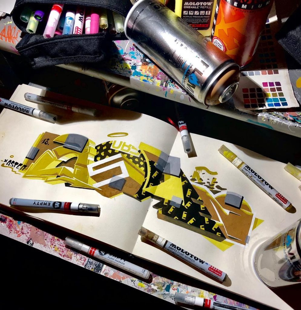
by Asten
This almost feels like an architectural graffiti drawing of some sort to me. He does an awesome job of overlapping shapes and suggesting depth with patterns.

by Babs
This is just unreal to me, Babs is one of the most unique voices in graffiti its insane to me that he has found out a way to take what looks like metal junk and still write out a legible tag. I love the element of perspective he gives with the poles in the foreground. This is a guy definitely worth a follow.

by The Speed One
Solid letter design with a metallic sheen to really make his work stand out.

by Taste
Stay tuned for our interview with Tasteburns on October 9th.

by Asno
Dope 3d wild style piece by Asno. Making magic with the Molotow One4All paint markers!


