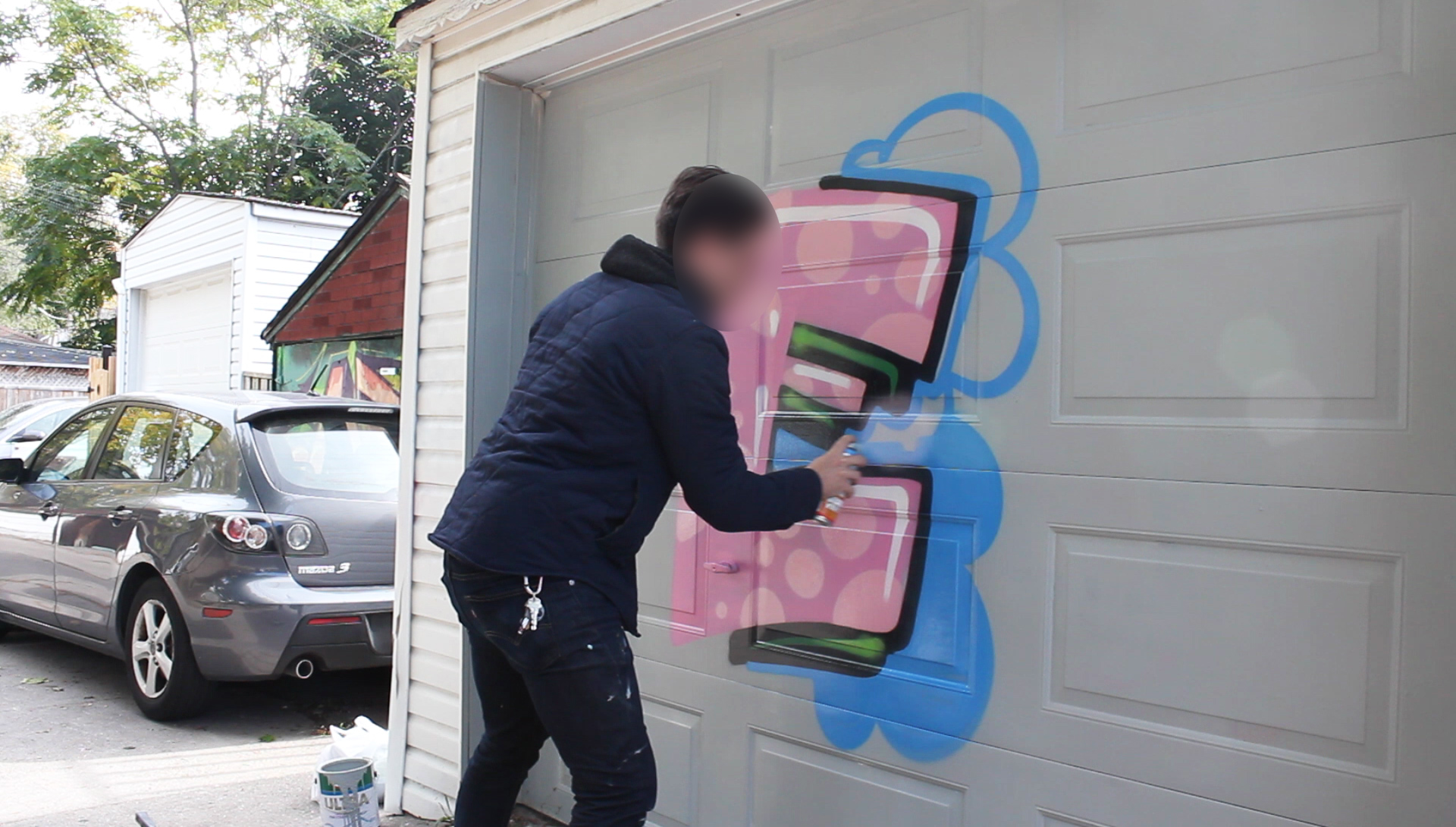
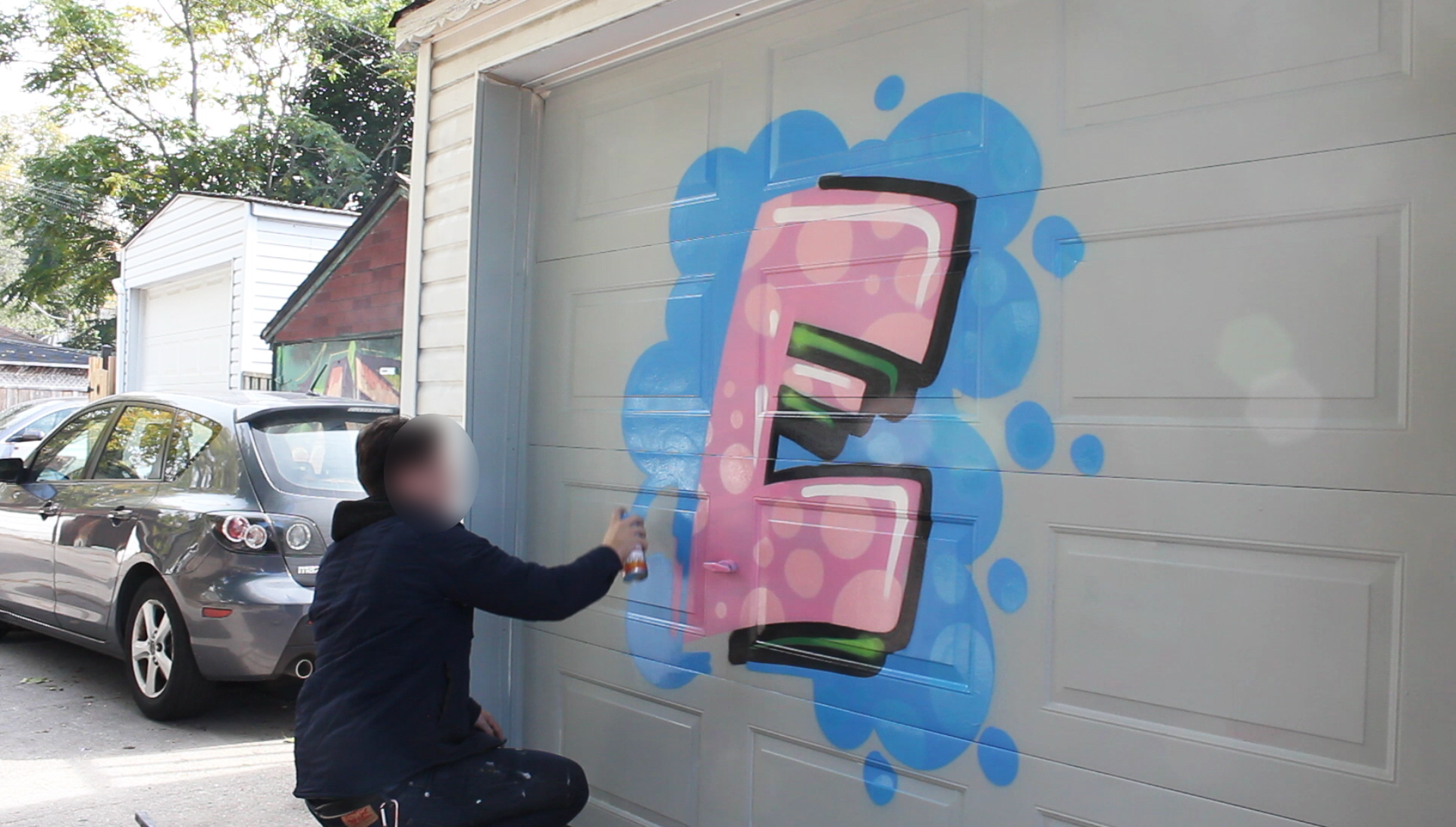
Backgrounds and Forcefields
We’ve been saying this a ton already, but we’ll say it again; here’s where we get to have some real fun, taking the viewer and aspiring writers into the “after effects” of a piece – extra flavour. Backgrounds and forcefields (also known as unis, double outlines, etc…), are what tie everything all together.Back in the day, these things weren’t always, prominent. Forcefields more so but background were something we seemed to only rock on serious productions. Now, it’s much more of a common thing, but because these are the looser and more expressive add-ons, we can really have fun and make this your own piece.
Background:
Let’s hit the ground running on backgrounds. Similar to background elements these are where you can add some extra fill techniques to explode off the wall with brute force. There seems to be all sorts of fresh backgrounds that go on trend, such as bricks, halftones and clouds, just to name a few. Like many things extra in graffiti, these help bring a certain amount of cohesion to the piece, as well as add a fair amount of size which is always an added touch to your work. We always say bigger is better in just about everything we do, and in the graffiti world that rings true.
People tend to almost be more pumped when they see that the extra size and time has gone into your work. These are also elements that are real fun to paint because they’re the far more looser than some of the other aspects, but they hold a lot of weight, especially in productions. What’s also extremely dope about these elements is that you can tie everyone’s pieces together by having the group by everyone implementing similar aspects.
Another one of the most important aspects to having backgrounds in your piece is that if you’re rocking on a surface that has already been painted before, it gives you the chance to fill out the area behind your letters, essentially giving it its own buff job. But a far more impressive and sexy buff job. There’s almost nothing worse than rocking a tight ass burner and then seen old marks or scribbles in the background. Though this happens from time to time when you’re rocking a quick jam, but it generally makes the work look un-pro, and that’s exactly what we don’t want.
>> SHOP: Spray Caps (Fat Caps, Skinny caps, Adaptors)
Tutorial:
- When attacking a background, it’s important to know that this is an added on element that will sit behind your piece, just like the name it is a background. So you want to make sure you have a vision of what the piece will look like as a whole before you know where to put your background.
- One of the easiest ways to do this is to already have your outline and 3D done and begin painting around that creating a surface area in which you will fill in later after you’ve decided what sort of background you will be using. If you will be doing bubbles in your background be sure to see how much space you have in between the end of the surface you’re painting and the piece you have currently floating on it.
- Once you’ve established that, start using your rounded arm movements creating circles that are going all around the outside of your letters. It’s nice to do various sizes of circles to give it more depth and for it to not look exactly like one big blob. You also might want to try and add little dots outside of the big bubbles to make it look as it they are coming out of the base circles themselves – giving the illusion as if they’re rising to the top, floating to side or trickling to the bottom of the wall.
- After you’ve created your original circles, begin to fill them in as if you would the fill in your letters. Essentially you want this to rest on the outline but be cautious of your outline as to not go too far into it too ruin that. However, this is exactly what cuts are for! If at any point you’ve drips, sprayed or overlapped too far into your outline, you can simply just cut back with the outline colour to give it that straight clean edge.
- Another way to do this is to in fact paint the background before you paint your outline or 3D. This would allow you to avoid needing too many cut backs and it would also allow you to spray over top the background, so that the piece will rest perfectly in front of it in one shot. This tends to be a bit trickier in the beginning stages of your spraying career as you have to have the foresight to know exactly where you want your outline, 3D and/or drop shadow to go.
- Once you’ve filled all of the based of the background in, you can begin to add more funk. You can add lines running through it to give the illusion of bricks, more bubbles in it for speed and extra colour, various shapes such as zebra or cheetah to resemble different patterns, or just more fades in the background to spice it up. In this regard, the world is your oyster and you can choose whatever you feel comfortable with for your piece. As we’ve said before, it’s generally important to keep the background either neutral or contrasted from the outline so it looks as if it’s jumping off the line.
- Now talking about tying pieces together, we’ll move on to the forcefield element on a piece. This has a number of different names like was stated in the introduction, but we’ll just call it forcefield here for arguments sake. The forcefield is walk not only brings a writer’s entire piece together, but makes the letters jump off the wall.
- Forcefields are most desirable as contracting colours from not only your outline colour, but your background as well. If it doesn’t have that contrast in colour, it won’t give it that pop that we so desperately look for. That is to say if you’ve got a black outline, you may want to put neutral colours in the background and then a vibrant ass forcefield popping off the BG.
- Now forcefields at their inception were primarily on the line of the outline as a vibrant buffer between that and the background or in many cases no background.
- In painting forcefields, we tend to paint them as if we are painting our highlights. They can be off the line or one the line, whichever you so choose. The purpose of this is to break either your background or the background of the wall acting as a buffer and giving it that concealing element or “outer glow”.

- Once you’ve decided how you want to do your outline, choose a starting pout you’re most comfortable with spraying and get to work. Generally we start the forcefield where we start our letters working left to right, but that’s not set in stone. If you see a starting point that makes you feel more comfortable and your hands less shaky – go for it! The forcefield is very important to be in your graffiti stance, so you are in good control of your can direction.
- If you’re painting around your piece with an off-the-line forcefield, it’s always a smart move to keep the distance between the outline and the lines of your forcefield the same. If you’re painting an on-the-line forcefield, you path is set for you. All you need to do it merely mimic the outline trajectory and put the forcefield colour slightly around. However, with the ever-evolving craft of graffiti, this has started to change and there’s no reason to limit yourself to only the on-the-line forcefield. Do what it is you feel.
>> SHOP: Get FREE Graffiti Supplies with your order!
Conclusion:
Some writers even have the forcefield come in, out and over top the outline, 3D and fill itself. As always, stuff like this is always up to you. There’s also a really tight way of bringing in both of these elements together and creating an awesome effect and that is by doing connecting multiple forcefields. Generally this is done by keeping the lines in the same colour swatch and going from either darkest to lightest or lights to darkest. It also depends on what you’ve got going for your outline.
The forcefield also tends to be that final element of the piece, where you’re tying the whole piece or even production all together. It’s often why we save it for last so you can finish it up, take a step back and see the full creation in its entirety.
More or less everything we’ve learned over these past few tutorials, is that we’re tricking the viewer’s eye with everything we’re doing to make the various elements jump off the wall. That’s why when you do contrasting colours on forcefields and backgrounds, we’re giving the illusion to the eye that things are interacting with each other the way they should.
So as you can see, from single to double to triple forcefields and from sprinkles to back splash backgrounds, this is where we’re going to have some serious fun. Unlike some of the other elements, especially like fill techniques and letter structure, these are simple tactics to bring any lettering from zero to hero.


